
BitGo Cryptocurrency Wallet
My time at BitGo was spent improving the user journey, starting from the marketing site, but it continued through the product life cycle. The brand started with the first contact point like an event or advertisement but BitGo’s problem was how the actual platform looked and performed once you were a customer.
The application was a collection of features around a cryptocurrency wallet built with no modular or reusable components, constructed over a number of years with no overlying architecture or standards from feature to feature. This resulted in a fragmented experience that was difficult to update, for even the most basic things like colors, labels or error messages.
Luckily, I arrived at the right time, when there was an opportunity to standardize things, correct things that were wrong and envision the future of the product from the ground up. When I started, we couldn’t even tell you everything that was wrong or how our experience ranked among our competitors.
I brought my research and information architecture background to catalog, compare and ultimately help correct years of neglect around the user onboarding process, in app messaging and user journey while the engineers worked on tech debt.
Analysis
We first went through the process of onboarding and setting up accounts to truly experience what the BitGo application was like and document it for a road map.
We created a matrix to log all the steps and, through heuristic analysis, looked at all of the usability issues within the application and onboarding process. This list detailed what was to be broken up in specific Jira tasks in sprints to be vetted and prioritized by the product managers and engineers.
My team and I provided a complete list of things that needed attention and recommendations, and examples on how to resolve them. We worked with the principal UX Designer to wireframe them and get hem prioritized on the road map.
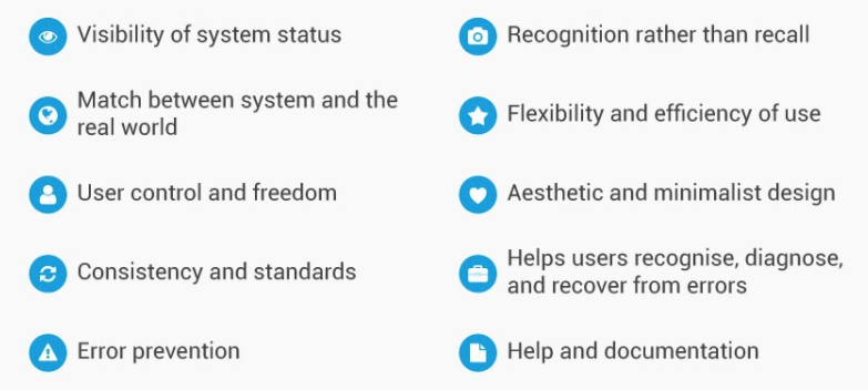
https://www.nngroup.com/articles/ten-usability-heuristics/
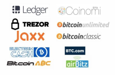
The company had never really looked at the competition to see where they were in comparison before. The CEO actually was very resistant to research and wanted to “look forward not side-to-side or backward,” as he assumed that competitive analysis was expensive and slow.
Luckily with perseverance I was able to convince him that I could solve critical product gaps with minimal budget and a few weeks time :)
Within a matter of a few weeks we had analyzed our competition to see where our strengths and weaknesses were, and to determine those critical features and flows that were putting us at a disadvantage. This exercise along with the heuristic analysis gave a clear picture of the current state of our product, as well as concrete steps and tasks to improve it. I also proved to the CEO that research could be effective, timely and bring results without being slow and costly.
Design
The research brought to light a number of difficult challenges that centered around messaging, labels, error states and basically all the words throughout the platform.
The content had been written over the years by engineering staff who may not have spoken English natively and were not aware or concerned with the consistency of the rest of the journey or application.
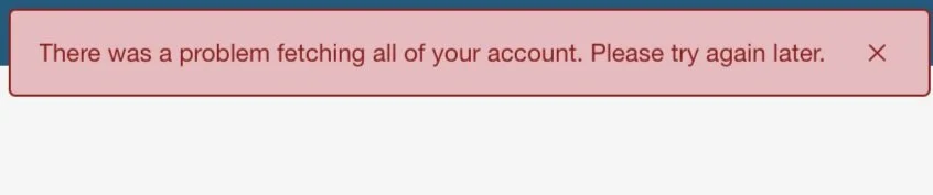
We rewrote all of the error states and all messaging across the platform for clarity, accuracy and proper grammar.
We defined out the user journey and mapped to the various stages and touch points with all of the different departments and systems. We created new templates and audited/standardized the content to be within brand tone and voice.
Looking at things from a macro perspective, this enabled us to ensure all communications matched the look and feel of the company and were of the quality that a financial services company should have. It also helped identify where new touch points should be and outline new interactions and flows that could be created to replace manual processes or gaps in the experience.
Those touch points included everything from account emails to user guides to be given to the administrators and users of the platform to help onboard them to the product, and give vital information to customers setting up/configuring the BitGo product suite.
Each of the product suites and features were defined, and I used the design thinking process to extract out all the inputs and assemble them into a series of deliverables that would help drive tutorial videos and in-app help and training.

Focusing on the presentation of the entire company including the product, I was also given the opportunity to refine the product pitch deck for the past series C funding rounds that told the story of BitGo’s platform and company vision.
I worked closely with C-level executives to create the narrative and illustrate it with a unified style that was a true reflection of quality and good design.
Helping visualize the company goals and positioning gave a way for C-level execs to communicate more efficiently and really tell the BitGo story to potential clients, employees and beyond.
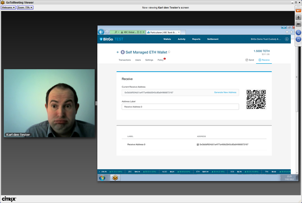
Giving the ability to show the actual product app or do remote usability testing to the world had always been a problem for BitGo due to incredible security restraints and technical challenges around authentication.
We tried multiple approaches around creating a fully functional HTML prototype that mimicked the real environment, but the product was always evolving and it would not be maintainable. In the end I worked with Engineering to create a testing sandbox that was separate from everything else but still had all the functionality.
This testing environment was accessible from the outside—easy for C-levels and product managers—and actually worked with real (test) blockchain assets that could be used in our demo videos, usability testing and pitch meetings.
Validation
Both remote usability testing and customer feedback was done as time permitted. The goal was to use remote platforms like usertesting.com and trusted customer partners to ensure that what we were delivering was truly usable, and validated by people outside the company (not developers).
Results
The end result was a holistic design approach that is consistent across all channels and communications. Many of the component designs and features that were developed for the marketing site influenced the new redesign UI, and features like the stock ticker and preloading /loading animations.
That approach produced a unified brand and tone that is visually appealing, as well as clear concise instructions, labeling and messaging that were all user centered and met budget and time restrictions all too familiar to a small startup.